

Definition
Statistics
This is a branch of mathematics dealingwith collection, analysis, interpretation and presentation of masses of numerical data
Statistical Methods
It is a systematic introduction to the essential techniques that all learners must understand to complete a module in statsistical analysis.
In these notes we will learn more methods of statistical presentation and analysis i.e
- Age-sex pyramids
- Dot maps
- Choropleth maps
Methods of Statistical Presentation
Age-sex Pyramids
- Is a graph used to present population data showing the different age groups for males and females
- It is used to show the numbers of different age groups in a population by considering their ages and sex
- It consists of bars, which are drawn horizontally
- The length of each bar indicates the number of persons in each age-group in a population
- Population is usually divided into 5 year age - groups
- The age groups are known as cohorts E.g. 0-4, 5-9, 10-14, 15-19, 20-24
- While drawing the pyramid, males are usually represented on the left side of the graph and females on the right
- The youngest age-group always forms the base of the graph
Steps Followed when Constructing an Age Sex Pyramid
Step 1
Identify the respective sexes from the table given
Step 2
Establish the number of cohorts in the population
Step 3
Determine the number or percentage males and females in each cohort
Step 4
Using the number of males and females in the cohort, choose an appropriate horizontal scale
Step 5
Choose an appropriate vertical scale as determined by total number of cohorts
The bars should not be too wide or too narrow
Step 6
Using a graph paper, draw two vertical parallel line at the centre of the paper with 2 cm space between them
At the base of the right line, draw a horizontal line to the right and do the same to the left line.
Step 7
In the 2 cm space indicate the cohorts beginning with the lowest age-group in ascending order
Step 8
On the horizontal line to the right mark 0 at the point of intersection between vertical and horizontal lines increasing the value to the right. On the horizontal line to the left, do the same.
Mark the cohorts to the right to represent females and those to the left to represent males
Step 9
Draw the respective bars in each cohort and shade them neatly
Step 10
Frame the age-sex pyramid and give it a title
How to Calculate the Percentages of Males and Females in Each Cohort
- Calculate the number in each age group as a percentage of the total population as shown in the table
For example
In age group 0-4
% Males = 2,291,936/14,205,589 × 100 = 16.13%
% Females = 2,242,966/14,481,081 × 100 = 15.49%
Age-group Males 000,000 Females 000,000 %Male %Female 0-4 2,291,936 2,242,966 16.13 15.49 5-9 2,00,580 1,962,556 14.08 13.55 10-14 2,034,980 2,003,655 14.32 13.83 15-19 1,681,984 1,721,194 11.84 11.83 20-24 1,328,529 1,504,389 9.35 10.38 25-29 1,094,909 1,164,594 7.70 8.04 30-34 840,692 845,230 5.91 5.83 35-39 695,263 723,749 4.89 4.99 40-44 516,989 516,989 3.63 3.57 45-49 41984 1,418,987 2.95 2.89 50-54 344,639 340,167 2.42 2.34 55-59 223,691 236,325 1.57 1.63 60-64 194,513 214,715 1.36 1.48 65-69 140,969 160,364 0.99 1.10 70-74 118,601 135,524 0.83 0.93 75-79 79,166 81,620 0.55 0.56 80+ 103,487 86,956 0.72 0.60 Total 14,205,589 14,481,081 - Choose a suitable scale to represent the percentage of males and females in each age-group. Example, from the table, 0.5 cm represents 2% on the horizontal axis
- Draw a pyramid using the scale and percentages
Analysis of Age-sex Pyramid
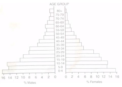
- In developing countries, the young people are usually more than the adults. Therefore the age-sex pyramids for such countries have a broad base
An age-sex pyramid of Kenya based on 1999 population - In developed countries, the young people are fewer than the adults. Thus the age-sex pyramid have a narrow base while it's broad in the middle ages and narrow at the older age groups
Age-sex pyramid of a developed country e.g. USA, China, Spain etc.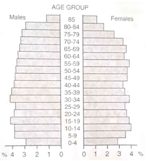
Interpretation of Age-sex Pyramid
- A pyramid of a developing country where age-sex pyramid has a broad base means that there are more children and youth than the adults. This indicate that there are more dependents, thereby stressing the working population and the economy
- It also indicates that there is a high birth rate
- The narrow apex indicates that there are fewer older people in the society because of low life expectancy
- A pyramid of a developed country where the age-sex pyramid has a narrow base, means that the birth rate is low.
- This indicates that there are fewer young people depending on the working population leading to high standards of living
- It has a broad apex indicating that there are many older people in the population due to high life expectancy
Advantages of Age-sex Pyramids
- It can easily enable comparisons of population for various countries
- It has a variety of useful information for planning purposes E.g. Sectroral interventions
- Shows the proportion of males to females in each age-group, thereby giving a clear picture of the characteristics of a given population.
- It is easy to construct, once the age-groups are given
- It is easy to read and interpret
Disadvantages of Age-sex Pyramids
- It is tedious to draw and time consuming
- It is difficult to choose a suitable horizontal scale
- If age-groups are many, the graph can take up much space
- It doesn't give an impression of the whole population
Dot Maps/Distribution Maps
- These are maps that use dots to describe the distribution of phenomena
- Each dot represents the number of items in an area like location, district, country or county
- It represents absolute or actual quantities on a map. e.g. one dot may represent a number of people, number of livestock etc.
Factors Considered when Constructing a Dot Map
Dot Value
- It's importance is to represent the actual number of items or phenomena in a given area
- It also helps to determine the number of dots to be placed on a map E.g. How many goats.
- Wrong dot value can lead to a wrong impression regarding the distribution of phenomena
- A low dot value will lead to many dots on a map while a high dot value will lead to few dots which will give an equal wrong impression E.g. 1 dot rep 1000 cattle
Dot Size
- Must be considered alongside dot-value and dot location
- The dots should be of uniform size and nature
- Dots should not be too large or too small
- The size and number of dots should be in such a way that they convey a clear visual impression of differences in distribution
Dot Location
- It is a difficult exercise
- There are two recommended methods
- First, calculate the number of dots to be used to show the distribution. Then place the dots as evenly as possible over the area concerned
- The other method takes into account the quantities to be represented and attempts to place the dots in their correct position on the map
- It requires one to have first hand information about the area to avoid placing dots in a wrong place E.g. Population distribution(Some places may be densely populated while others scarcely populated)
- In case one does not have prior knowledge of the area an accurate dot map can be constructed using information gathered from other maps of the area
- It is advisable to calculate the number of dots that will be required in areas of dense concentration first
Constructing a Dot Map
The steps followed when constructing a dot map are as follows
- Preparation should first be made by marking on the map the position of all dots, very slightly, in pencil
- A pen with round, flat tip is used to draw dots of the correct size, circular and uniform in character in the positions marked in (a)
- On the other hand, circular, uniform dots can be drawn using a paper punch
- The small circular paper pellets punched out from the paper can be glued on the map and then the whole map is mounted on a black paper
It is important to note that:
- If the dot map is to retain its importance as a distribution map, representing absolute values by dots of specific value, it should not be combined with other methods of statistical representation on the same map.
- Dot value should be kept as low as possible
- The map should have a key, title and a scale
- Distribution of two or more items may be shown on the same map by dots of different colors or sizes
How to Draw a Dot Map: Example
- The table below shows the number of livestock per division in Bungoma district
Province No. of livestock Kanduyi 40,000 Bumula 70,000 Webuye 100,000 Sirisia 80,000 Kimilili 120,000 Total 410,000 - For us to represent these figures using dots, we need to choose a suitable scale/dot value. To choose a suitable scale/dot value, we consider the highest value among the given figures. In our case for example, we have Kimilili having 120,000. So we should choose a scale which will ensure that the number of dots in this area are not too many. The suitable scale is therefore 1 dot to represent 10,000 livestock.
- The dots for each division are now as follows
Kanduyi = 40,000/10000 = 4 dots
Bumula = 70,000/10000 = 7 dots
Webuye = 100000/10000 = 10 dots
Sirisia = 80,000/10,000 = 8 dots
Kimilili = 120000/10000 = 12 dots - The dot map for livestock distribution in Bungoma district based on the above table will be as follows.
A Dot Map Showing Livestock Distribution in Bungoma District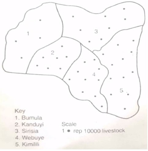
- NB: - The dots should be evenly distributed in the specific area.
- The Title should be underlined and if possible the whole figure should be enclosed in a frame
Analysis and Interpretation of Dot Maps
- The distribution of the dots will give a clear view on areas with high or low quantities E.g. A high concentration of dots indicates a high concentration of the bariable being mapped
- The dot value as per the scale is important in assisting the calculation of the total value of the variable in the region
For example if 1 dot rep 1000 cows and in one area there are 20 dots. The actual number of cows in the area is calculated as follows
1 dot = 1000 cows
20 dots = ?
20 dots×1000 cows = 20,000 cows
1 dot
Advantages of a Dot Map
- It can be used to show the distribution of different phenomena in the same geographical unit'
- If the dot value is known, it is easy to calculate the total population
- They are easy to interpret
- It gives a good visual impression of comparative densities and distribution of phenomena
- If the key is given, it is easy to calculate the total population
- It has a wide use. If constructed as an overlay on a transparent paper it can be used to make comparisons and correlations of different geographical phenomena
Disadvantages of a Dot Map
- Calculation and placement of dots is time-consuming
- Miscounting of dots can lead to wrong data of the total population of phenomena
- Rounding off fractions, say 3.8 to 4 dots leads to wrong number of dots plotted on the map
- It is tedious to draw dots of uniform sizes and shape unless special pens or pencils are used
- Location of dots reflects to a certain extent a personal subjective decision
- When dots overcrowd they give the impression that the distribution of phenomena is dense
- Even distribution of dots give false impression of the distribution of phenomena
Choropleth Maps
- Derived from two Greek words
Choros - area or space
Plethos - multitude or number - Shows the relationship between quantities and area
- Desnities in different areas are shaded differently in colours or patterns
- They are also called density or shaded maps
Drawing of Choropleth Maps
The following are the steps followed
- Draw boundaries of the statistical units
- Calculate average densities for each statistical unit by dividing the quantities in each unit by the unit area
Density = Total quantity/Area of unit - Determine a suitable scale of densities to be used in shading the map
- Indicate lightly in pencil on the map the grade of shading or colouring to be used for each area
- Shade or colour the map, erasing figures and all other unnecessary information but leaving boundary lines
- Give a title and key to the map
Precautions Taken while Constructing Choropleth Maps
- The shading should show a progressive increase in density
- Avoid a blank because it can give the wrong impression of zero density.
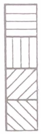
Example of different methods of shading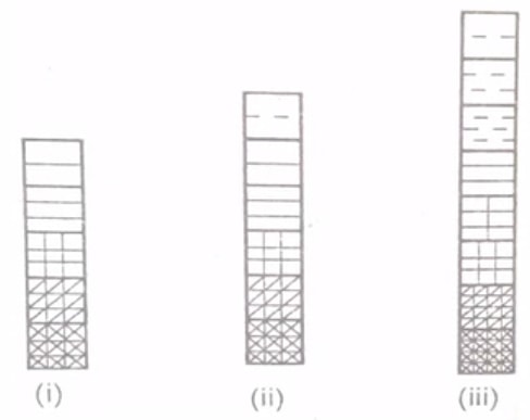
- The range of values may be divide into groups by either arithmetic progression when the range is not great. E.g. 1-10, 11-20, 21-30, or a geometric progression e.g. 1-10, 11-20, 21-40, 41-80, 81-160, 161-320
- Variation in density can also be drawn by proportional shading i.e. by drawing horizontal lines close together to represent increase in density e,g. see the bars below
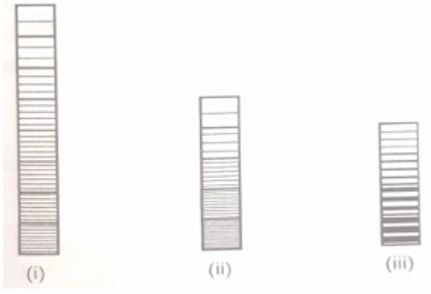
- Do not show variation in density by merely drawing lines at different angles e.g.
- A more pleasing appearance of continuity and transition can be achieved if shading lines are "carried across" as far as possible
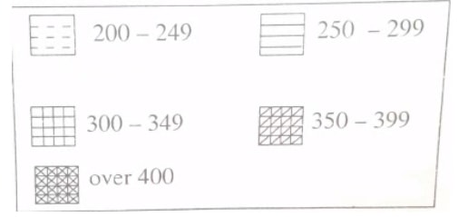
- It is advisable to use a key with individual boxes
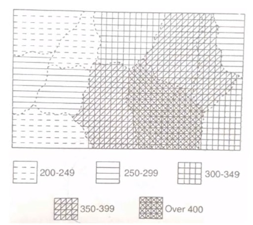
Example of a Choropleth Map
- Use the data in the table below to draw a choropleth map
Division 1 2 3 4 5 6 7 8 9 10 11 12 13 Desnity 200 250 360 270 380 400 450 500 460 230 310 280 360 - Choose a suitable scale and shade as shown below
- Show the divisions with boundaries and density figures for each division
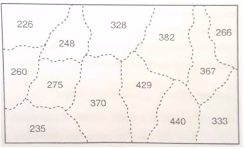
- Shade the map using the scale indicated. The map will be as shown below
Analysis and Interpretation of Choropleth Map
- The different colours used and density of shading shows trends in the value of phenomena being mapped
- It thus displays variation in phenomena like population density
For example, a dark colour to show high population density, a lighter shade to show lower population density
Advantages of Choropleth Maps
- They are easy to construct
- They are easy to compare densities at a glance
- They give a good visual impression
Disadvantages of Choropleth Maps
- They can be confusing of the boundaries are not clearly marked
- It is not possible to show the distribution of more than one phenomenon on the same map
- They give wrong impression that density changes abruptly at the boundaries in a given map
- Using the same statistics, it is possible to give very different impressions by altering the grades or the shading
- They give the impression that densities are uniform within each region
- Calculations and shading are laborious and time consuming
Download Statistical Methods - Geography Form 4 Notes.
Tap Here to Download for 50/-
Get on WhatsApp for 50/-
Why download?
- ✔ To read offline at any time.
- ✔ To Print at your convenience
- ✔ Share Easily with Friends / Students