- Introduction
- Frequency Distribution Table
- Grouped Data
- Representation of Statistical Data
- Past KCSE Questions on the Topic.

Introduction
- This is the branch of mathematics that deals with the collection, organization, representation and interpretation of data. Data is the basic information.

Frequency Distribution Table
- A data table that lists a set of scores and their frequency
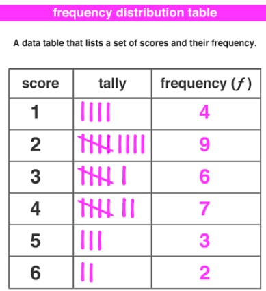
Tally
- In tallying each stroke represent a quantity.
Frequency
- This is the number of times an item or value occurs.
Mean
- This is usually referred to as arithmetic mean, and is the average value for the data
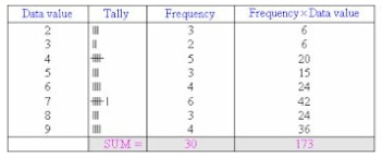
The mean ( ̅x )
=total marks scored
total number of students
= ∑fx
∑f
=173
30
= 5.767
Mode
- This is the most frequent item or value in a distribution or data. In the above table its 7 which is the most frequent.
Median
- To get the median arrange the items in order of size. If there are N items and N is an odd number, the item occupying (n+1/2)th
- If N is even, the average of the items occupying n/2

Grouped Data
- Then difference between the smallest and the biggest values in a set of data is called the range. The data can be grouped into a convenient number of groups called classes. 30 – 40 are called class boundaries.
- The class with the highest frequency is called the modal class. In this case its 50 ≤ m < 60, the class width or interval is obtained by getting the difference between the class limits. In this case, 30 – 40 = 10, to get the mid-point you divide it by 2 and add it to the lower class limit.
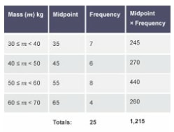
The mean mass in the table above is ∑f = 25 , ∑fx = 1215
Mean 1215/25 = 48.6

Representation of Statistical Data
- The main purpose of representation of statistical data is to make collected data more easily understood.
- Methods of representation of data include.
Bar Graph
- Consist of a number of spaced rectangles which generally have major axes vertical. Bars are uniform width.
- The axes must be labelled and scales indicated.
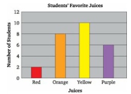
- The students’ favorite juices are as follows
Red 2
Orange 8
Yellow 10
Purple 6
Pictograms
- In a pictogram, data is represented using pictures.
- Consider the following data.
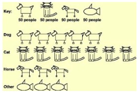
- The data shows the number of people who love the following animals
Dogs 250, Cats 350, Horses 150, other 150
Pie Chart
- A pie chart is divided into various sectors .Each sector represent a certain quantity of the item being considered the size of the sector is proportional to the quantity being measured .consider the export of US to the following countries. Canada $ 1 3390, Mexico $ 81 36, Japan $5824, France $ 21 1 0 .
- This information can be represented in a pie chart as follows
Canada angle
= amount of export x 360
total population
13390 x 360 = 163.62o
29460
Mexico =8136 x 360 = 99.42o
29460
Japan 5824 x 360 = 71.16o
29460
France 2110 x 360 = 25.78o
29460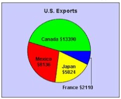
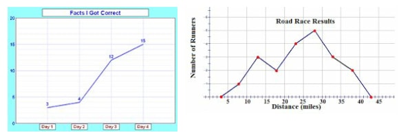
Line Graph
- Data represented using lines
Histograms
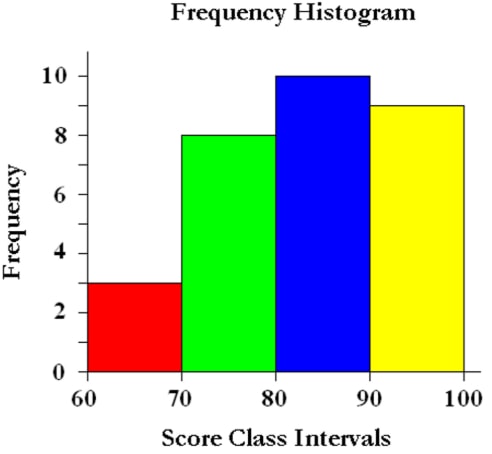
- Frequency in each class is represented by a rectangular bar whose area is proportional to the frequency, where the bars are of the same width and the height of the rectangle is proportional to the frequency .
Note; - The bars are joined together.
- The class boundaries mark the boundaries of the rectangular bars in the histogram
- Histograms can also be drawn when the class interval is not the same
The below information can be represented in a histogram as below
| Marks | 10 - 14 | 15- 24 | 25 - 29 | 30 - 44 |
| No.of students | 5 | 16 | 4 | 15 |
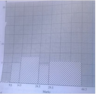
Note;
- When the class is doubled the frequency is halved
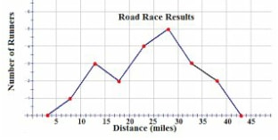
Frequency Polygon
- It is obtained by plotting the frequency against mid points.

Past KCSE Questions on the Topic.
- The height of 36 students in a class was recorded to the nearest centimeters as follows.
148 159 163 158 166 155 155 179 158 155 171 172 156 161 160 165 157 165
175 173 172 178 159 168 160 167 147 168 172 157 165 154 170 157 162 173- Make a grouped table with 145.5 as lower class limit and class width of 5. (4mks)
- Use your table in (a) to draw a histogram to represent the data
-
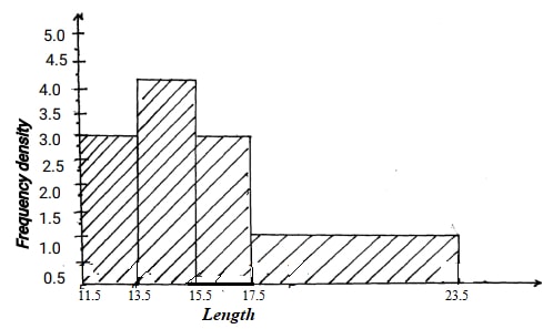
Use the histogram above to complete the frequency table below:
Length Frequency 11 .5 ≤ x ≤ 13.5
13.5 ≤ x ≤ 15.5
15.5 ≤ x ≤ 17.5
17.5 ≤ x ≤ 23.5 - Kambui spent her salary as follows:
Draw a pie chart to represent the above informationFood 40% Transport 10% Education 20% Clothing 20% Rent 10% - The examination marks in a mathematics test for 60 students were as follows;-
60 54 34 83 52 74 61 27 65 22 70 71 47 60 63 59 58 46 39 35 69 42 53 74 92 27 39 41 49 54 25 51 71 59 68 73 90 88 93 85 46 82 58 85 61 69 24 40 88 34 30 26 1 7 1 5 80 90 65 55 69 89
From the table;Class Tally Frequency Upper class limit 10-29
30-39
40-69
70-74
75-89
90-99- State the modal class
- On the grid provided , draw a histogram to represent the above information
- The marks scored by 200 from 4 students of a school were recorded as in the table below.
Marks 41 – 50 51 – 55 56 – 65 66 – 70 71 – 85 Frequency 21 62 55 50 1 2 - On the graph paper provided, draw a histogram to represent this information.
- On the same diagram, construct a frequency polygon.
- Use your histogram to estimate the modal mark.
- The diagram below shows a histogram representing the marks obtained in a certain test:-
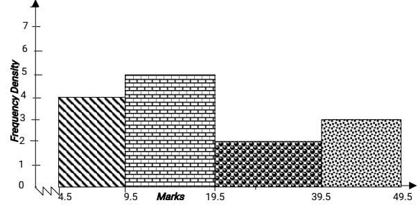
- If the frequency of the first class is 20, prepare a frequency distribution table for the data
- State the modal class
- Estimate:
- The mean mark
- The median mark
Join our whatsapp group for latest updates
Tap Here to Download for 50/-
Get on WhatsApp for 50/-
Download Statistics - Mathematics Form 2 Notes.
Tap Here to Download for 50/-
Get on WhatsApp for 50/-
Why download?
- ✔ To read offline at any time.
- ✔ To Print at your convenience
- ✔ Share Easily with Friends / Students

